一. 需求: CSS代码实现一个带三角型的气泡框
二. 如何实现
创建页面结构
1
2
3
4
5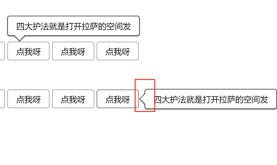
6<div class="app">
<div class="wrap" >
好好学习天天向上
</div>
<button class="button">点击</button>
</div>Javascript
1
2
3
4
5
6
7
8
9
10
11
12
// 将显示的元素通过js放在 按钮的位置
window.onload= ()=>{
let $ = function (className){ return document.querySelector(className); }
$('.button').click = ()=>{
document.body.appendChild($('.wrap'));
let {width,height,left, top} = $('.button').getBoundingClientRect();
let {height:height2} = $('.wrap').getBoundingClientRect();
// -height-12为 按钮的高度 加箭头的高度 和 边框厚度
$('.wrap').style.top = top+window.scrollY - height-12+ 'px';
$('.wrap').style.left = left+window.scrollX + 'px';
}
}
3.CSS1
2
3
4
5
6
7
8
9
10
11
12
13
14
15
16
17
18
19
20
21
22
23
24
25
26
27
28
29
30
31
32
33
34
35
36
37
38
39
40
41
42
43
44
45
46
47
48
49
50// 按钮样式
.button{
font-size: 14px;
height: 32px;
padding: 0 1em;
border-radius: 4px;
border: 1px solid #999;
background-color: #eee;
display: inline-flex;
justify-content: center;
align-items: center;
vertical-align: middle;
}
.app{
display: inline-block;
vertical-align: top;
position: relative;
}
.wrap{
position: absolute;
border: 1px solid #333;
border-radius:4px;
padding: .5em 1em;
// box-shadow: 0 1px 1px rgba(0, 0, 0, .5);
filter: drop-shadow(0 1px 1px rgba(0, 0, 0, .5));
background-color: white;
max-width: 20em;
word-break: break-all;
&::before,&::after{
content: '';
display: block;
border: 10px solid transparent;
width: 0;
height: 0;
position:absolute;
transform: translateY(-100%);
margin-top: 20px;
}
&::before,&::after{
left: 10px;
}
&::before{
border-top-color: black;
top: 100%;
}
&::after{
border-top-color: white;
top: calc(100% - 1px);
}